How to Read Stock Charts India — Technical Analysis for Beginners
Stock charts tell a story. Every candle, every line, every spike in volume — it's the market talking. And once you know how to listen, you start making decisions based on data, not gut feeling. In our experience at Finoda, most first-time investors in India never got this one lesson. This guide fixes that — from scratch, in plain language.
- Types of Stock Charts — Line, Bar & Candlestick Explained
- Candlestick Chart Patterns — Most Important for Indian Markets
- Support and Resistance — The Foundation of Technical Analysis
- Key Technical Indicators — RSI, MACD, Moving Averages
- How to Use Technical Analysis for NSE & BSE Stocks
- Common Mistakes Indian Beginners Make Reading Charts
- Where to Practice Chart Reading — Free Tools in India
- Frequently Asked Questions — How to Read Stock Charts India
- Start Reading Charts — Then Start Investing with Confidence
Types of Stock Charts — Line, Bar & Candlestick Explained
There are three main chart types you'll see on platforms like NSE India, Zerodha Kite, or TradingView. Each one shows price movement differently.
Line charts connect the closing price of a stock each day with a straight line. Simple. Clean. Good for spotting a long-term direction. But they hide a lot — you can't see how wild the day was, or where prices opened.
Bar charts (also called OHLC charts) are a step up. Each bar shows four price points: Open, High, Low, and Close. Still less visual than what most traders use today.
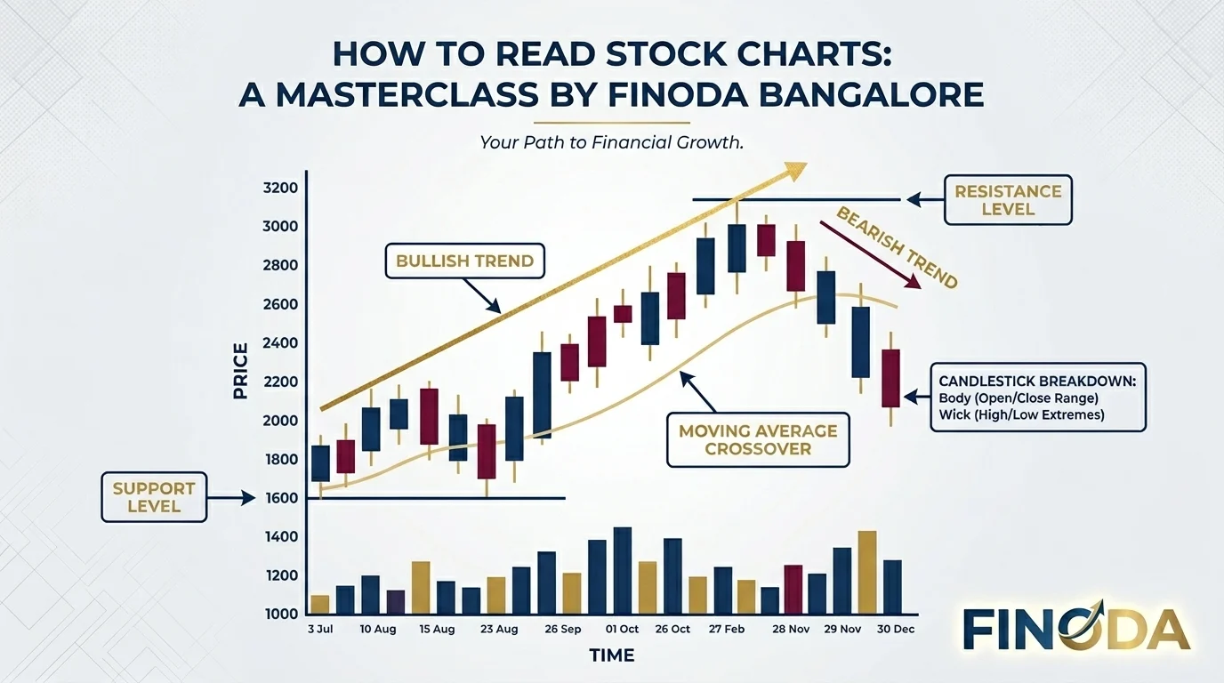
Candlestick charts are the gold standard. They show the same four data points — but in a block-and-wick format that makes the story instantly readable. A green candle means buyers won the day. A red candle means sellers took control. And the wicks? Those show where price tried to go but got pushed back.
We've found that new investors learn fastest with candlestick charts. Everything else builds on them.
What Does a Candlestick Actually Show?
Each candle has three parts:
- Body — the thick block. Shows the range between opening and closing price.
- Upper wick — shows the highest price hit during that time period.
- Lower wick — shows the lowest price hit.
A long upper wick on a red candle? Sellers slapped the price down hard. A long lower wick on a green candle? Buyers stepped in and pushed it right back up. These wicks are rejection signals — they tell you where the market said "no."
Candlestick Chart Patterns — Most Important for Indian Markets
This is where most traders spend weeks learning. But honestly? You don't need to memorise 50 patterns. Focus on the 6-8 that actually show up on Nifty 50 and BSE stocks regularly.
Doji — The open and close are almost the same price. The body is tiny. This means indecision. Neither buyers nor sellers won. After a strong uptrend, a Doji near a resistance level is a warning sign. Something is about to shift.
Hammer — A small body at the top with a long lower wick. This shows that sellers tried to push the price down, but buyers came back hard. It's a bullish reversal signal — especially powerful at support zones.
Bullish Engulfing — A small red candle followed by a large green candle that completely swallows it. Buyers took over. After a downtrend, this pattern on Nifty 50 stocks with high volume is a strong entry signal.
Bearish Engulfing — Opposite of above. A small green candle followed by a large red candle. Sellers are taking charge. At resistance? Time to be careful.
Shooting Star — Small body at the bottom, long upper wick. Price ran up hard during the session but closed near the open. Buyers tried and failed. Classic reversal signal at resistance.
Morning Star / Evening Star — Three-candle patterns. Morning Star is a bullish reversal after a downtrend. Evening Star is a bearish reversal after an uptrend. These patterns are highly reliable when they form near key support or resistance levels.
In our experience, these patterns matter most when they appear with above-average volume. A bullish engulfing on low volume is noise. The same pattern with 2x or 3x average daily volume? That's worth paying attention to.
Support and Resistance — The Foundation of Technical Analysis
Every Indian trader who reads charts uses support and resistance, whether they know it or not. These are price levels where the market has a "memory."
Support is a price zone where buyers have stepped in before and stopped the price from falling further. Think of it as a floor. Resistance is the opposite — a ceiling where sellers historically push the price back down.
Here's the thing: these zones are more reliable on round numbers and high-volume price levels. A stock that bounced at ₹500 three times in a year? That ₹500 level is meaningful. The market remembers it.
How to Draw Support and Resistance on a Chart
- Open the daily chart for any Nifty 50 stock.
- Look for price levels where the stock reversed direction at least twice.
- Draw a horizontal line at that level.
- The more times price touched that level and bounced, the stronger it is.
When price finally breaks through a strong support level, it often becomes resistance. This is called role reversal. It's one of the most consistent concepts in Indian technical analysis.
Key Technical Indicators — RSI, MACD, Moving Averages
Indicators are tools, not oracles. We've seen too many new traders glue themselves to RSI and forget to look at the actual price. But used right, a few indicators are genuinely useful.
RSI — Relative Strength Index
RSI measures how fast and how much a price has moved. It runs from 0 to 100. Above 70 means overbought (the price has run up fast and may slow down). Below 30 means oversold (the stock has been beaten down and may bounce).
But here's the catch — in a strong trend, RSI can stay above 70 for weeks. Don't use RSI alone to short a strong uptrend. Instead, use it to spot divergence. When price makes a new high but RSI doesn't? That's a warning that the move is losing steam.
MACD — Moving Average Convergence Divergence
MACD shows the relationship between two moving averages (usually 12-day and 26-day EMA). When the MACD line crosses above the signal line, it's a bullish signal. Below? Bearish.
On weekly charts for BSE stocks, MACD crossovers are particularly worth tracking. They're slower signals, but more reliable for positional traders who hold for weeks.
Moving Averages — The Simplest Trend Tool
The 50-day and 200-day moving averages are the most watched lines on any Indian stock chart. When a stock is above its 200-day MA, the long-term trend is up. When it's below? The trend is down.
The Golden Cross (50-day MA crossing above 200-day MA) is a bullish signal. The Death Cross (50-day crossing below 200-day) is bearish. These patterns get a lot of coverage on financial news platforms — and rightly so.
A simple rule: don't buy against the 200-day MA. It's not always right, but it saves you from the worst mistakes.
How to Use Technical Analysis for NSE & BSE Stocks
Reading charts is one thing. Using them to actually trade on NSE and BSE is another. Here's how we suggest approaching it.
Step 1 — Pick your timeframe. Are you an intraday trader? Use 5-minute or 15-minute charts. Swing trading for a few days? Daily charts. Long-term investing? Weekly charts. Each timeframe tells a different story.
Step 2 — Identify the trend. Is the stock making higher highs and higher lows? That's an uptrend. Lower highs and lower lows? Downtrend. Don't fight the trend — trade with it.
Step 3 — Find key levels. Draw your support and resistance zones. These are your entry and exit planning zones.
Step 4 — Look for a setup. A bullish candlestick pattern at support in an uptrend, confirmed by above-average volume — that's a setup. A single candle in isolation means nothing.
Step 5 — Set your stop-loss. This is the most important step. Every trade needs a level where you say "I was wrong, I'm out." For most setups, the stop goes just below the recent low.
Step 6 — Define a target. Look at the next resistance zone. That's your target. If the reward is at least 2x the risk, the trade makes sense.
We follow SEBI guidelines in all our advisory work at Finoda. Chart analysis is a key part of how our team assesses market conditions for our clients.
Common Mistakes Indian Beginners Make Reading Charts
And yes — we've seen all of these. A lot of them.
Over-relying on indicators. RSI, MACD, Bollinger Bands — they're all derived from price. Price is the primary signal. Don't let indicators distract you from what the chart is actually saying.
Ignoring volume. A breakout without volume is unreliable. Always ask: did this move have conviction?
Changing the timeframe to suit the trade. If your setup doesn't work on the daily chart, don't switch to the 15-minute chart until it looks right. That's called "timeframe shopping" and it leads to bad entries.
Trading against a strong trend. Support levels break. Resistance levels break. In a strong downtrend, buying at every support feels logical — until you realise the whole chart structure has shifted.
Not having a stop-loss. Probably the most common and most expensive mistake.
Where to Practice Chart Reading — Free Tools in India
You don't need to risk real money to learn. Here are the best free platforms to practice on Indian stocks:
- TradingView India — Best charting tool available in India. Full feature access on the free plan. Supports NSE and BSE data.
- NSE India Official Website — Live charts for all NSE listed stocks with OHLC data.
- Moneycontrol — Good for charts alongside fundamental data.
- Zerodha Kite — If you already have a Demat account, the charting tools are excellent.
And if you want to open a Demat account and start trading with full guidance from our team — we're here.
Frequently Asked Questions — How to Read Stock Charts India
Internal Link: Know more About Finoda →
Start Reading Charts — Then Start Investing with Confidence
Chart reading isn't a magic formula. But it's one of the most practical skills any investor in India can develop. Once you understand what a candlestick is telling you — once support and resistance levels start making sense — the market stops feeling random.
We've helped thousands of investors in Bangalore and across India take that first step. And it almost always starts with understanding a chart.
Open a free Demat account with Finoda and get started today.